6 Examples of Captivating eCommerce Landing Pages
Landing pages are web pages that are designed to persuade visitors to take a specific action, such as buying a product, signing up for a newsletter, or downloading a free trial. Landing pages are essential for eCommerce businesses, as they can increase conversions, generate leads and boost sales.
But what makes a landing page captivating and effective?
In this article, we will look at six examples of eCommerce landing pages that have mastered the art of persuasion and learn from their best practices. Whether you are selling clothes, books, software, or anything in between, we hope that these examples will inspire you to create captivating landing pages for your eCommerce website.
To learn more about the key elements needed to create an effective landing page, tune in to the Real eCommerce Podcast where we explain these elements in full detail and provide you with a guide on how to build a landing page that can instantly grabs people’s attention.
How are they different?
eCommerce landing pages offer distinct advantages over standard product pages by providing a focused, streamlined experience tailored to specific marketing objectives:
- Clear CTAs: landing pages prominently feature a singular CTA, guiding visitors toward a specific action such as making a purchase or signing up for a newsletter. This reduces distractions and encourages conversion
- Limited Exit Pathways: unlike standard product pages, landing pages typically remove navigation menus and other exit pathways, keeping visitors focused on the intended action without the temptation to browse other parts of the website or leave altogether
- Targeted Content: landing pages are designed to resonate with a specific audience and product, leveraging tailored messaging, visuals and content to address their needs, pain points and desires effectively
- Optimised for Campaigns: landing pages are often created to complement marketing campaigns, ensuring alignment with campaign messaging, imagery and targeting strategies. This optimisation enhances campaign performance and conversion rates
eCommerce landing pages offer a concentrated and persuasive user experience, driving higher conversion rates and maximising the effectiveness of marketing efforts.
Key Elements of an Effective eCommerce Landing Page
As mentioned in our previous article, the six key elements that make an eCommerce landing page effective are as follows:
Product in Use:
- Demonstrates real-life application
- Helps potential customers visualise themselves using the product
- Increases understanding of product features and benefits
Video Content:
- Engages visitors with dynamic visuals
- Provides a deeper insight into the product
- Appeals to auditory and visual learners simultaneously
Comparisons:
- Highlights the unique selling points
- Assists customers in making informed decisions
- Builds credibility by showcasing advantages over competitors
Social Proof:
- Establishes trust through testimonials, reviews and ratings
- Validates the quality and reliability of the product
- Alleviates concerns by showing others’ positive experiences
Make Buyers Feel Special or Apply Urgency:
- Creates a sense of exclusivity or urgency to act
- Incentivises immediate action through limited-time offers or special deals
- Makes customers feel valued and appreciated, fostering loyalty
Prominent CTAs
- Guides visitors towards desired actions
- Clearly communicates the next steps
- Increases conversion rates by reducing friction in the buying process
Apple iPhone 15
Key Elements
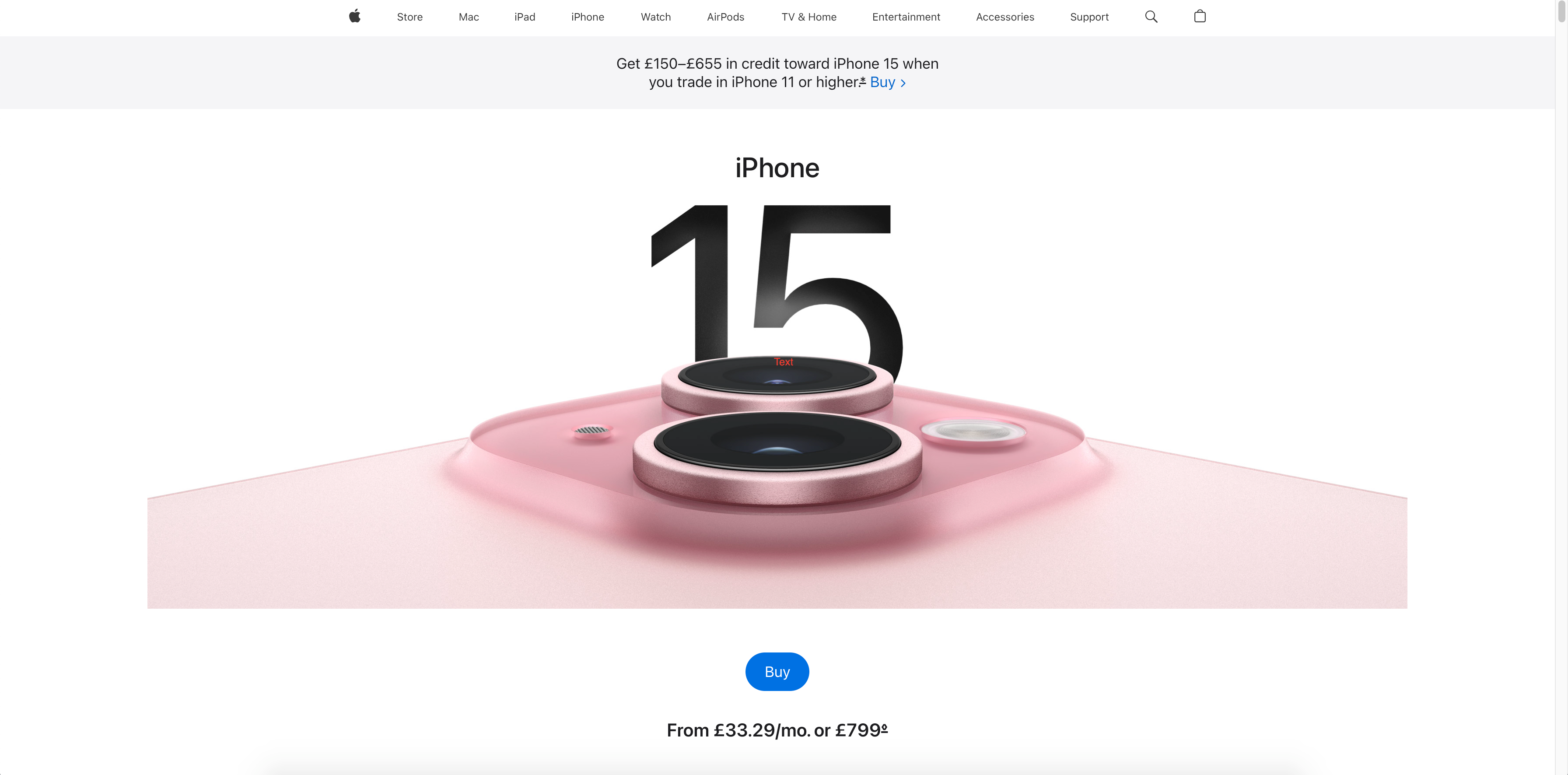
Visual Content & Product in Use: this engaging landing page uses high-quality images and 3D views to showcase the iPhone 15 from different angles and perspectives. The visual content highlights the sleek design, vibrant colours and impressive features of the product. Near the top of the page, there is a link to a video that shows the product in use, giving viewers an immersive experience of the phone and its features.
Make Buyers Feel Special: ways to shop include one-to-one personal sessions and bespoke shopping experiences. Direct language also makes buyers feel special and as though the phone has been designed specifically for them. For example, ‘In an emergency, iPhone has your back’ and ‘All-day battery life. For all the things you want to keep doing.’
Prominent CTAs: The ‘Buy’ button above the fold is a simple call-to-action that uses a clear and direct action verb to encourage visitors to take action and purchase the product. The blue button stands out against the white background, capturing attention. The price is included directly underneath, immediately providing visitors with key information.
Although there is the straightforward ‘Buy’ button at the top of the page, there are a variety of creative CTAs placed throughout the page, such as ‘Dive into the display’ and ‘Go deeper on design’, which directly relate to particular features. For convenience, they remain sticky as the visitor scrolls down the page on both desktop and mobile devices. The plus icon on each CTA stands out and encourages visitors to find out more about a functionality that appeals to them.
Other Important Features
Value Proposition: Apple is a well-known and respected brand that has a loyal and passionate customer base. The landing page doesn’t need to rely on social proof like reviews, ratings or testimonials to persuade visitors to buy the product, as most people are already familiar with and trust Apple’s products. The landing page instead focuses on showcasing the unique features and benefits of the iPhone 15 that differentiate it from other smartphones on the market. The bold headings, sharp images, snappy copy and clear call-to-action buttons make the key selling points stand out to potential customers.
Alternative Ways to Shop: trade-in options are mentioned at the top of the page, with more ways to ‘shop and save’, such as monthly payment options and shopping in the app.
Mobile Optimised Design: the iPhone 15 landing page maintains its high quality, visual appeal and responsiveness across mobile devices. Images and videos load fast and all content is optimised to fit smaller screens.
Key Takeaway: The Apple iPhone 15 landing page showcases the product’s unique features and benefits without relying heavily on social proof, leveraging Apple’s brand reputation instead. Through high-quality visuals and prominent calls-to-action, the page engages visitors and drives sales.
Kravebeauty Great Barrier Relief

This product and landing page combination is a great example of how to persuade and educate potential buyers.
Key Elements
Video Content: a short and sweet video clip demonstrates how to apply the product. Accompanying text highlights how it works for different skin types, making potential buyers feel valued.
Social Proof & Product in Use: it’s clear how much Kravebeauty place importance on what their customers think. This landing page features ‘before and after’ images of real customers who have used the product and seen visible results. There are also social media videos showing the product being used, as well as detailed reviews and ratings that highlight the benefits and satisfaction of the product.
A key element that could be improved is the CTAs. There aren’t many of them and they’re not very engaging or personalised – for example, ‘Add to Cart’ and ‘Show More’. Although the Add to Cart button is included above the fold, visitors must scroll almost to the bottom to reach more CTAs. They also don’t stand out amongst the surrounding content.
Makes the Buyer Feel Special/Relatable: this eCommerce landing page is designed to appeal to buyers who have a range of skin problems, such as dryness, redness, sensitivity or acne. The product is presented as the solution to these problems and the brand uses language to indicate that it understands and cares about the buyers. For example, it describes an ingredient as ‘the soccer parent of skincare ingredients’ and the email sign-up copy states ‘Let’s be friends, but like, over the internet.’
Other Important Features
Value Proposition: the features and benefits of the product are mentioned frequently throughout the page via copy such as, ‘a blend of nourishing oils and rebalancing actives restore damaged skin to clear breakouts and soothe irritation.’ The colourful text boxes, catchy headings and bright imagery in the middle of the page draws in visitors and encourages them to discover more about the product’s value.
Mobile Optimised Design: this landing page loads quickly on mobile devices and all content is appropriately sized and formatted to fit smaller screens. The ‘Add to Cart’ CTA remains sticky on mobile devices, making it quick and easy to make a purchase.
Another effective aspect of this eCommerce landing page is how Kravebeauty attempt to upsell by adding links to their other products, including a suggestion of which product to pair the serum with.
Key Takeaway: This Kravebeauty landing page uses video content and social proof effectively to engage potential buyers and encourage them to make a purchase. By addressing common skin problems and presenting the product as a solution, Kravebeauty connects with consumers and emphasises its value proposition.
GoPro HERO12

Key Elements
Visual Content & Product in Use: this product landing page is packed with high-quality images and videos demonstrating how the GoPro HERO12 can be used to film a variety of activities, such as skateboarding, flying and snowboarding. The videos also showcase new features of the HERO12 such as stabilisation, autoboost and horizon-lock.
Social Proof: the Reviews section of this landing page is helpful for those deciding whether to make a purchase. It consists of recent five-star ratings from verified buyers and details of how they used the GoPro. There’s also a Q&A section with answers to questions from potential buyers.
Makes the Buyer Feel Special/Relatable: the images and videos show the product being used by people who share the buyer’s passion and lifestyle, such as adventurers, explorers and creators. There’s a clear indication that the product is designed for this specific target audience and the brand understands their needs.
Prominent CTAs: the ‘Add to Cart’ CTA remains on the screen on both desktop and mobile devices as a visitor scrolls down the page, making it easy and convenient for them to buy the product at any point.
Other Important Features
Value Proposition: as this landing page explores key features of the GoPro, it details the benefits for the user with messaging such as, “It’s compact, easy-to-use, and designed to go anywhere” and “smooth, even lighting in a range of conditions.”
Mobile Optimised Design: this landing page maintains its stunning visual appeal on mobile devices and navigation is quick and easy. All videos load fast and play automatically as visitors scroll down the page.
Key Takeaway: By showcasing the HERO12 in action across various activities and emphasising its new features like stabilisation and autoboost, this landing page appeals to its target audience of adventurers and creators. The inclusion of prominent calls-to-action encourages conversions, while effective messaging reinforces the product’s value proposition of being compact, easy-to-use and versatile.
Parka London

This is another effective combination of a landing page and product page.
Key Elements
Social Proof & Product in Use: customer reviews dominate this landing page as the brand understands the importance of using them to sell the product. There are images of customers wearing the product, detailed testimonials, five-star ratings and Trustpilot reviews to establish trust. By clicking on the customer images, visitors can see more details about the product that they’re wearing and there’s a link to view it on the shop. The brand has also linked its Instagram to the page, which shows more images of people wearing its products in different locations.
Other Important Features
Product Images: visitors are met with high-quality images of the product in different colours, from various angles and being worn. There’s also an image that points out specific features and USPs that may set it apart from competitors.
Value Proposition: messaging such as “unmatched warmth and durability, whatever the weather” and “keep your hands warm whilst keeping your belongings with you” conveys the benefits of the product and encourages consumers to make a purchase.
Mobile Optimised Design: this landing page is fast to load and easy to navigate on mobile devices. Visitors can quickly swipe through product images and customer reviews.
Key Takeaway: Parka London uses social proof and visually appealing imagery strategically to establish trust and showcase the product’s unique features and benefits, ultimately driving potential customers towards making a purchase decision.
Asus ROG Ally
Key Elements
Visual Content & Product in Use: this highly interactive product landing page is bursting with vibrant and engaging video content, moving visuals, graphs and 3D graphics that demonstrate the technical features of the product and show it being used.
Social Proof & Comparisons: at the top of the page, before going into greater detail about the features of the product, there are sections with links to awards, video reviews and media reviews, illustrating that the brand aims to convey how its product is superior to others on the market. Many of them compare the device to competitor products and the snippets from each review catch the attention of potential buyers who are scanning the page for key information.
The customer reviews are useful because they provide ratings for ‘Quality’, ‘Ease of Use’ and ‘Performance’, as well as showing authenticity by including the ‘Most Helpful Critical Review’ and allowing consumers to view 1-star reviews.
Makes Buyers Feel Special/Relatable: throughout this landing page, the brand illustrates how it has the end user in mind by using messaging such as “If you have a larger game library, the Ally has you covered” and “Share the fun by connecting to a TV and pairing multiple controllers.”
Prominent CTAs: as the visitor scrolls down the page, the menu bar remains above the fold, making it convenient to find specific information about the product, including the Tech Specs, or make a purchase via the ‘Buy Now’ button which stands out in red. As the page is long and packed with content, there is a handy arrow button on the bottom right which sends visitors back to the top.
Other Important Features
Value Proposition: as a high value product which is much more expensive than direct competitors like Nintendo Switch or Steam Deck, a potential buyer needs to be convinced to spend the additional money. Therefore, this page is packed with technical details, features and benefits, with a focus on the device performance and design as key selling points. At the top of the page, there is a breakdown of specific features with CTA buttons for consumers to find out more about each.
Mobile Optimised Design: the immersive user experience of this landing page is maintained seamlessly on smaller screens. For a web page that’s so packed with engaging visuals and content, the fast load time is impressive. The YouTube reviews also load quickly when clicked on. The ‘Buy Now’ button and menu options remain at the top of the page as visitors scroll down the page on mobile devices.
Key Takeaway: The Asus ROG Ally landing page uses scroll-stopping visual content and a focus on technical details, performance and design to illustrate the product’s superiority and appeal to potential buyers. By showcasing awards, video reviews and comparisons with competitor products, the brand builds credibility and trust.
Troubadour Apex Backpack

Another great example of a product and landing page combination.
Key Elements
Video Content & Product in Use: there’s a short and sleek video at the bottom of the page that plays automatically to highlight specific features of the backpack and show the product in use.
Social Proof: to persuade potential buyers to make a purchase, the brand has included recent five-star customer ratings and the ability to filter reviews by star rating. “The Best Laptop Backpack” endorsement from NYT Wirecutter in the description at the top of the page could succeed in convincing consumers to buy this product over similar competitor offerings.
Other Important Features
Product Images: there’s a great choice of high-quality images at the top of the page, to include close-ups of particular features and the product being used. The images show multiple angles of the backpack, including the inside. The Instagram feed displays more sharp and stylish images of the product in use.
Value Proposition: the product’s key USPs are included in a simple, bullet point list in the description, with features and benefits highlighted in a dedication section with eye-catching iconography. In an aesthetically pleasing grid at the bottom of the page, technical details and benefits are explained in more detail, accompanied by smart and clean images.
Mobile Optimised Design: this landing page loads fast on mobile devices and all content elements fit smaller screens effectively. The quality of product images remains sharp and videos play automatically and smoothly.
Key Takeaway: This product landing page uses video content effectively to showcase product features and usability, complemented by social proof elements to build consumer trust. Additionally, high-quality product images and a clear value proposition boost the appeal of the product to potential buyers.
We hope these examples from top brands have provided you with plenty of landing page optimisation ideas. If you need support with crafting a captivating landing page for your eCommerce store that converts your target customer, please get in touch with our expert team.


